

Jointly Offer Portal
Streamlining how real estate agents submit offers.
Project Details
Details
Client: Jointly
Technology: Progressive Web App
Feature: Offer Portal
Year: 2020-ongoing
What is Jointly?
Jointly is a digital real estate platform that helps real estate agents draft, manage, and collaborate on offers.
My Role
User research / Wireframing / Prototype testing / Hi-fidelity designs / Acceptance criteria for design to dev handoff / Usability testing / Quality assurance
Team Members
UX/UI Designers: Erika Marquez & Kyla Daley
Product Manager: Jessica Lemley
Project Overview
All real estate transactions start with an offer, so this was the first page Jointly wanted to focus on building as an early stage startup. This feature focused on creating a centralized hub for real estate agents to submit offers on properties utilizing data pulled in from the MLS. We were tasked with understanding what information and resources agents needed to see in order to feel confident in submitting an offer on a property using our platform and design an experience that would help them reach that goal.
The Challenge
Although technology has made major advancements, the real estate process has not. Currently, when a buyer agent finds the perfect property for their clients and are ready to submit an offer, they need to dig around different websites to find pertinent data, use separate platforms to generate and fill out the offer, and then send it to the listing agent, typically via email, with the hopes they will see it among their typically full inbox. It’s a time consuming process that is highly stressful, prone to user error, and disjointed.
Our Solution
Our solution was an offer landing page that details information specific to building an offer, include seller’s preferences to help buyer agents build winning offers, and give them the ability to start the offer right on our platform. By having these items all in one place, this page would save agents time and provide them with the necessary resources to confidently and quickly start their offer.

“How might we help buyer agents streamline the offer submission process?”
The Process

Research
Hypothesis: If we can create a page that distills offer data from the MLS and various other sites, it will cut user’s time to start an offer and make the process more seamless.
Our first step was to understand the current process and figure out what exactly buyer agents need in order to successfully submit an offer. Our internal subject matter experts are real estate agents, so they shared with us what they see when viewing the MLS, and shared examples of offer instructions they’ve received for various listings they’ve put offers on. From that, we generated a few assumptions that we needed to validate.
Our assumptions included:
Agents don’t need to see the listing details in the Offers Portal because the agent has already seen it in the MLS and is ready to make an offer.
Agents don’t need to see a large image of the home in the Offer Portal because they’ve already seen it in the MLS.
Agents want a mobile way to draft offers, because they’re always on the road. They need the ability to submit offers while on the go without always having to carry their laptop with them and wait for wi-fi.

Card Sorting Exercise
We did a card sorting exercise to understand what kind of information buyer agents typically received in offer instruction packets. We analyzed about 10 different offer instructions for separate listings and wrote down what each had. We then organized them into different columns to find what each had in common. Based on this, we defined what information needed to be on the page.
Important information included:
Escrow officer information
Preferred earnest money
Preferred option amount
Preferred option period
Listing agent information
Documents related to the listing
HOA information
Mortgage approval requirements
Wireframes
After the card sorting exercise we worked with our subject matter experts and stakeholders to understand what other items were required to have on the offer portal. We deduced that it’s incredibly important to know basic information about the listing, including list price, property type, and listing status. A photo was necessary to ensure the agent that they were on the correct property. Buyer agents needed the ability to start an offer right on the page. In addition, they believed it was important to know how competitive the listing was, so they wanted to see how many people have placed offers on the property and how many are in the middle of the offer process.
From this, we quickly got to work on a few wireframe layout examples. We utilized Whimsical to create rapid wireframes and distilled our favorite layouts down to 3 to test out to understand which one users felt emphasized the information they wanted to know.
-
Iteration 1

-
Iteration 2

-
Iteration 3

Prototype
Testing
We had 2-3 days to squeeze in testing into our sprint so Kyla and I broke up responsibilities. I put together the interview and testing questions while Kyla set up a presentation that we used as the test. Once we got the tests scheduled, I handled driving the interview and Kyla focused on recording and taking down notes.
The Goal
To get an understanding of what agents think the page is for, learn if the info provided is relevant and helpful, what additional info they wanted to know, and understand a little more about their current process and habits.
The Outcome
Gained valuable insights to what data was important to users, which layout they felt made the most sense for their needs when ready to submit an offer, and learned about what they are thinking and doing when they typically create offers.
Affinity Mapping
One of the first things Kyla and I did after the test was create an affinity map to help find common patterns within the results.
Persona and Empathy Map
Using the data collected from interviews, we were able to generate a quick empathy map and designed a lo-fi user persona based off of common traits, behaviors, goals, and pain points. This helped us understand and define who the main users might be in this particular scenario.
Key Findings
75% of users were confused about the purpose of the page. They thought it was a listing or an info page about a house that was for sale.
50% of users liked the 3rd iteration.
100% of users disliked that they currently have to use various software programs to communicate, edit, and send forms and documents.
100% of users use a laptop to draft an offer. We assumed that users would appreciate having a mobile way to draft offers, but agents felt it was just easier on desktop because it’s easier to see details, have more capability than mobile, and can more easily move between screens.
Hi-Fidelity Designs
After we distilled the data and went through various UX exercises to understand our findings from testing, we then moved on to updating the design to address the usability concerns and working on the hi-fidelity version of the page. We ended up going on wireframe design iteration 3 and made updates to it based on our findings. We utilized Material Design’s component library to streamline the design and development workflow and applied our branding to make it our own.
Kyla and I worked on designing hi-fidelity mockups of different aspects of the page, as well as how it interacted responsively.


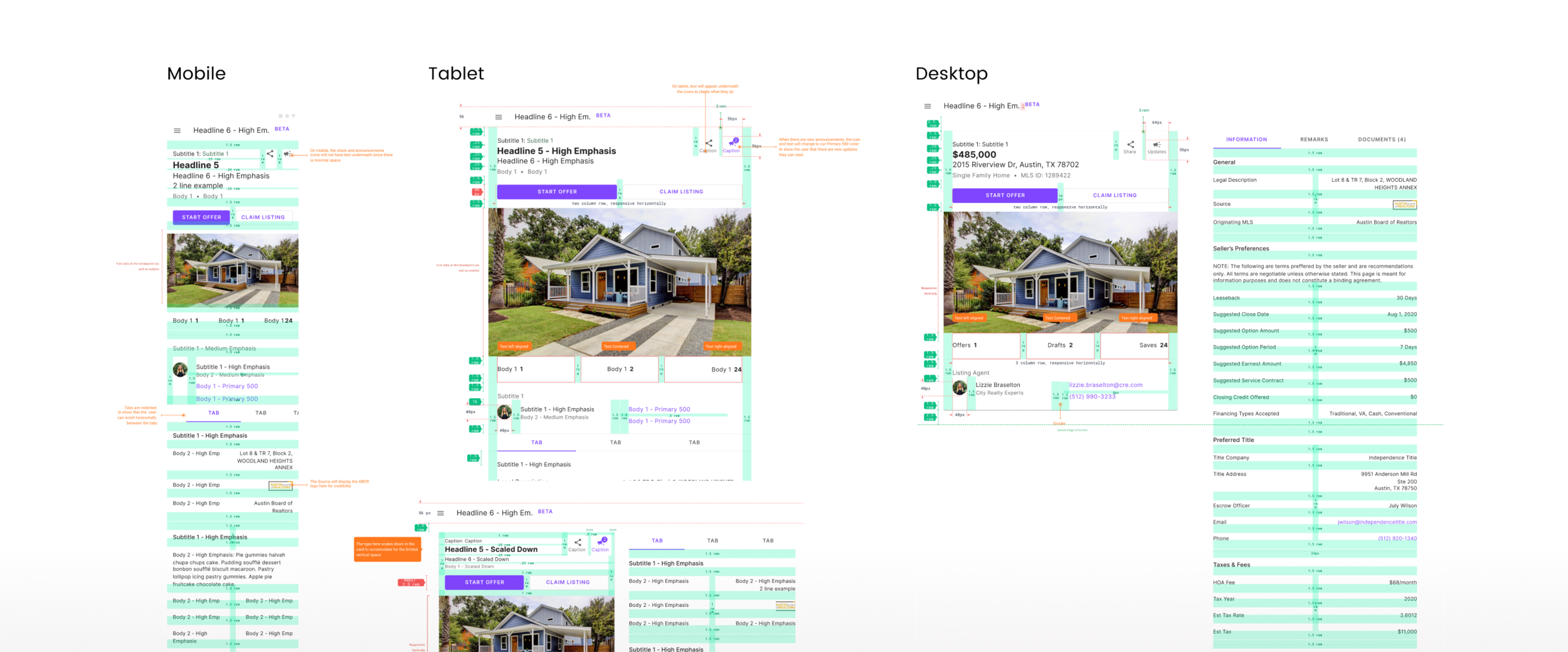
Responsive Design
We also took into consideration responsive views for the offer portal. Even though we found agents more than likely will start offers from their desktop, we needed to design what it looked like in different screen sizes. We were able to come up with a mobile friendly and intuitive design while still ensuring agents had a good experience navigating around the page.
Component Guidelines
After we completed the hi-fidelity designs and got them signed off from our primary stakeholders, we moved on to writing acceptance criteria and developing component guidelines to help translate how the designs were supposed to work to our developers.
Usability
Testing
Once the page was designed and built out, along with other critical features and workflows, we conducted usability testing to see if our product has met our user’s needs prior to launching the Alpha version. We tested out a buyer agent’s ability to start and draft an offer utilizing what we had built. We tested a total of 9 agents of various levels of experience and involved the whole product team to help facilitate the test. The following is specific to findings gathered from their experience with the Offer Portal.
Objectives:
Do users understand the purpose of this page?
Do users find the type of information provided on the page relevant?
Do users trust the service?

9 Test Users

4 Baby Boomers
5 Millenials

1 Newbie
3 Mid-Level
4 Veterans
Affinity Mapping
Because the test we did was fairly large and involved gathering a ton of qualitative data and the business was ready to move on to releasing Alpha, we only had time to do a large scale affinity map exercise to distill our findings. From this data, we were able to understand key insights that helped us narrow down on things we could do to help improve the page.
Key Findings
Did agents understand the purpose of the page?
Yes, but there is room for confusion.
50% believed the page was a place to read and review information about a property and the type of offer the sellers would like.
50% believed the page represented the offer itself and that they would be able to tweak the terms before submitting.
“It’s a listing overview where I can see info about the property.”
Did agents find the information on the page relevant?
Yes, agents appreciated that information they would normally have to hunt down was readily available, though there was some confusion around Seller’s Preferences.
100% thought that the Seller’s Preferences were non-negotiable, leaving them to think that they couldn’t make adjustments to their offer when they were filling it out.
“This is great, I don’t have to hunt this info down!”
Do agents trust the service?
Younger agents were intrigued by the platform with minimal concern, while older users were skeptical and apprehensive about using our platform.
New visitors want more proof of credibility and security to feel comfortable using the service.
Users want a chance to play with the software first.
“I’d feel better if I knew the MLS or other agents used this.”

Design Updates & Recommendations from Feedback
Based on our findings, we made quick updates to the original designs and detailed recommendations to help address some of the concerns the agents brought up during testing to help users feel more comfortable using the app.
Updates include:
Updated terminology to help users understand that the terms are negotiable.
Added a source description to show users where data is being pulled from.
Recommendations include:
Provide a page tour to help users better understand the page.
Create an interactive demo with the ability to toggle between roles that agent’s can easily play with before committing.
Reflection
Agents are averse to changing tools that they’re already heavily invested in, so it’s easy to understand why users would initially be skeptical about using it to replace their current tools. From our usability test, we were able to understand in more detail what agents are thinking and doing when they land on our page and know what things we should focus on to help address some of the concerns our agents have.
In addition to our findings, we also had to learn how to deal with a number of technical constraints, so there were some limitations to the ideas that we wanted to develop. From this, I learned to bring developers on early in the design process to help us understand what can and cannot be implemented so we can know what we need to adjust to make the page still work.
We’ve learned so much about our users since then. The page has proven to be helpful to agents as they’re drafting their offer but there are still a few confusion points they experience when landing on the page. These are items that we are planning to improve upon as we continue to build out our app and make updates from the feedback our beta users give.